Monday, June 13, 2011

it's not the end but a new beginning

Updated below: there's no need to subscribe to a new feed! If you already subscribed to this one, it will now pull from the new site, so you're all set!

My dear readers:

For some time I've been feeling a bit hamstrung: I love this blog and I want to keep its focus on early modern books and book history. But I'd like to have room to write beyond that mandate as well, as the mood hits. Rather than start a second blog, I've decided to create my own website, where I can not only blog about books but blog on other subjects and do all sorts of other things as my very own domain name.

So with this post I bid farewell to blogger and announce Wynken de Worde's new home at my new online home, sarahwerner.net. At the new site you can continue to read only the Wynken de Worde posts by viewing only that category of posts or by subscribing to its feed. Posts on topics other than early modern books will be in a different category, "In other words," which will have its own feed. Of course, you can just read everything by visiting or subscribing to the general feed. simply staying subscribed to the feed that originated with this site; I've updated it so that it now pulls from the new site, so there's no need for you to do anything if you're already subscribed! (This is how much I love that you read what I write and how much I hope you will continue to do so.) I'd be mightily surprised if I blog with any greater frequency there than I do here, so you certainly won't be swamped!

I'm going to leave this blog up so all your old links to it will continue to work, but I am shutting down comments. I've ported over all my old content from here so you'll be able to find it at my new site (albeit undoubtedly with some glitches). All new content will appear only at sarahwerner.net--indeed, there's a new post there right now waiting for you--so I will look forward to seeing you over there!

Saturday, April 23, 2011

an armorial binding mystery

Another book from my students' projects, this one with a curious binding:


At first glance, what you might see is an armorial binding: a binding in which an owner has stamped his arms in gold tooling. No big deal, really; there are plenty of books like those in libraries. But this one is more complicated: there are TWO coats of arms, one stamped on top of the other. Here's a close-up of the center of the binding, where the arms are:


And here's the picture again with one of the two arms outlined:


A close-up of the top portion, in which you can see that there are two crowns juxtaposed and the heads of two faintly visible supporters:


Looked at in raking light, you can see that the supporter on the right looks like an antlered stag:


And the supporter on the left looks like a horse:


I can't make out the details of the arms themselves, but you can see the motto on which the supporters are standing:


My student deciphered it as "fidei coticula crux" and that looks right to me.

If you look closely at that last picture, you can see that the arms with the supporters and motto was done second: its lines cross on top of the other arms. And if you look at the original arms, you might recognize them as James I's arms: there's the harp on the bottom left of the shield, the lions and fleur-de-lis quartering the right, and the motto "honi soit qui mal y pense" circling the shield. (This gives you some sense of the arms, though that harp is a bit excessive.) (And I should point out, although it's surely obvious by this point, that I'm not particularly knowledgeable about arms and that my vocabulary choices might not be quite precise. But this is why we need help.)

So whose coat of arms is on top of James's? Is it possible it's James's favorite, George Villiers, aka the first Duke of Buckingham? According to the Burke I was looking at, not only was the family's motto "Fidei coticula crux", but he used the supporters of "a dapple grey horse" and a stag. But, as I said, I'm not super confident of my ability to deal with armorial and geneological crap, so does someone want to confirm or deny this? I'm drawn to it because if someone WAS going to stamp their arms on top of the king's, wouldn't it be great if it was him? (If you're not familiar with this period, you might want to know more about Villiers; this link should, I hope, get you into the Oxford Dictionary of National Biography's article on him for the next few days [though April 27th]. If it no longer works, well, this would be a good time for you to do some scouting about on your own! If you know of some reliable open access information about him, please leave it in the comments. Or go edit the Wikipedia page, which could use improvement!)


I should say something about what book this is, I suppose. It's John Smith's 1624 The generall historie of Virginia, New-England, and the Summer Isles. It's a very interesting book, and there's some great marginalia in it, but that will have to wait until another post, especially since my student is still in the middle of her research! But the arms thing is tricky to decipher and the Folger catalog record identifies only one of the two crests (James's, of course), so I wanted to lend her a hand in getting it sorted out. And I certainly didn't want to lead her astray with my desire for it to be Buckingham! So please leave me a note telling me what you think and I'll pass it on to her.

Friday, March 11, 2011

O rare!

I've been looking at another book that a student was working on. It's unprepossessing on the outside, just a small, worn brown leather binding, with the remains of ties that have long since disappeared. But the book is much more interesting on the inside. Take a gander at some of the photos I snapped (I did these with my cell phone, so they're not super high quality, but they're not too bad either):


The whole book is like this, covered with marginalia. There are manicules, trefoils, asterisks, notes more and less extensive. It's a seriously used book.


And do you know who used this book so seriously? He inscribed his name right there on the title page:


O rare Ben Jonson! And while Jonson's book when he used it might seem unprepossessing, later owners certainly valued it for its association and house it accordingly, in its own locked box.


There's much more to be said about Jonson and his books but I wanted to get these pictures up before they burned a hole in my pocket. You can find the catalog record for this book here and I'll try to follow this up with a bit more Jonsonia.

(Oh, I suppose many of you got the title of the blog post, but just for clarification's sake: Jonson is buried in Westminster Abbey under a plaque that reads, "O rare Ben Johnson"--and yes, that's how it's spelled on the plaque, even though Jonson didn't spell his name that way.)

Sunday, February 20, 2011

that thei they thnt

My students are in the process of choosing the books they're going to work with this semester, so I've been looking at lots of books I haven't seen before. One of them is an English translation of Nicholas Monardes's Historia medicinal, a 1577 book with one of those glorious long titles: Ioyfull newes out of the newe founde worlde, wherein is declared the rare and singuler vertues of diuerse and sundrie hearbes, trees, oyles, plantes, and stones, with their aplications, aswell for phisicke as chirurgerie, the saied beyng well applied bryngeth suche present remedie for all deseases, as maie seme altogether incredible: notwithstandyng by practize founde out, to bee true: also the portrature of the saied hearbes, very aptly discribed: Englished by Ihon Frampton marchaunt. (Want more info? Check out the record on Hamnet.)


In doing her description of the book, my student noticed something funny about the headlines. They are set up to do something fairly typical: the book is divided into three parts, and the headlines tell you which part you are reading, as shown here:


"The first parte of the thynges that" is on the left-hand side of the opening, with the conclusion of the phrase on the other side of the gutter: "thei bryng from the West Indias."

The fun part is what happens on the left. On most of the pages, this part of the phrase appears as you would expect:


But sometimes, it goes a bit askew:


 or:


or even:


All these mistakes happen only in the first part of the book (although there are other errors in the headlines in the second and third parts). "Thei" is obviously a slip from the phrase's continuation and appears on signatures A1v, D1v, and F1v. "They" is a similar mistake; it appears on D3v and F3v. It's not connected to "thei"--by which I mean, it's not some sort of correction of "thei", which wouldn't make sense anyway, because "thei" is spelled perfectly acceptably according to early modern standards, as evidenced by the fact that it's spelled that way on the other side of the gutter. No, I know it's not a correction of "thei" because both mistakes appear on the outer formes of the D and the G gatherings: "thei" on D1v/G3v with "they" on D3v/G3v. In other words, they were both in use at the same time. (If this doesn't make sense, go back and practice your quarto folding again.)

My favorite, though, is the last one--"thnt"--which appears with the greatest frequency, on signatures B2v, C1v, G2v, and H2v. What in the world is "thnt"? It's "that" when someone has accidentally put an "n" in with the "a"s when he was redistributing the type. A good compositor would touch-set, just as a good typist touch-types. You don't look at where your fingers are on the keyboard; you look at what it is you are typing. If you're copying something (typing notes up from a book, for instance), you're looking at the book, not at your fingers or your typewriter computer screen. When you're grabbing type from the case and reading the manuscript that you're setting, you're not only not looking at each letter as you put it in the composing stick, even if you were to glance at it, it'd be a mirror image.

And that, my friends, is one of the reasons you proof your work.

Thursday, February 3, 2011

the small joys of looking at books

Take a gander at this book I was looking at today:

Boyer's The compleat French-master, 1699, Folger Shakespeare Library, Call Number: 263- 520q
Can you see what's going on here? It looks at first glance like the top page has been folded back, revealing the text of the previous leaf. But that's not it. You're looking at the verso side of sig. H4 and nothing else.

Can you see now that it's only one leaf?

Here's an image of what this leaf looks like in other copies of this book:

The Huntington's copy, as in EEBO

And now do you see what's happened? During printing, this leaf got folded over in the press, and the inside of the fold missed the type (that's the blank streak) and the outer part of the fold was, once unfolded, misaligned. Print the image off and fold it to see for yourself!

Here's the recto side of the leaf:

Boyer's The compleat French-master, Folger Shakespeare Library, Call Number: 263- 520q
You can see the crease from the fold, but since this side was already printed, there's no misalignment of the text.

I love this detail in this book. It's not really significant, it's just a tiny reminder that the book is a made objects, and that in making objects, things happen and sometimes leave their traces. It's one of the tiny joys I find in looking at books--not reading them, but looking at them.

That's it for my post. My new theory is to stick with the short and sweet. Now that the Folger allows readers (and staff) to snap their own photos, I'm determined to share more of the tidbits that I come across. I'll still do the longer posts, but at least this way I won't have such long periods of silence in between!

(A shout-out here to the cataloger who created the entry for this book. As with many items in the Folger's collections, this has a wonderfully detailed record, including the information that this fold was to be found. You can see the record for yourself--you'll notice that the book is full of other nice details. And the next time you encounter a cataloger, make sure you buy them a drink. Or chocolate. Or both.)

Wednesday, December 8, 2010

exploring Google eBook pricing


Updates below (added images in post, link to tweet in middle, new links at bottom)

And more updates! Check out the comments for a generous response from @bookavore with useful context for how pricing works.

So, as you surely know, Google has finally opened their eBook venture, selling e-books (to use a variant spelling that has been dominating) both through their own eBookstore and through partnerships with independent bookstores. One of the big excitements about Google's eBook program is the possibility of generating money for indies, who otherwise lose out the opportunity to generate revenue from digital books. So my first question was to wonder what it meant to go to an independent bookstore to get an electronic book. It's not like you're going to walk around the corner and chat with your local bookseller, right? I suppose you could do that, get their advice, and then go online and buy the book, but that seems odd to me. Are independent bookstores going to set up terminals where folks can login to Google and order their books while in the shop? That might be a way to preserve that seller-customer relationship. That's always been one of the things that I value about independent bookstores, the relationship between seller and customer. Of course, I don't have an independent bookstore around the corner from where I live or work, which is part of the larger problem sellers and buyers are facing.

As I was checking out which independent bookstores were participating, I was happy to see some of semi-locals, and I spent some time clicking around to see what was what. But in taking a quick look around at how Google eBooks have been incorporated into some different indie bookstores, I was soon struck by a much larger question: What is up with the pricing??

Here's what I mean. Take, for a first example, Stieg Larsson's latest, the huge hit and final book in the Millennium trilogy, The Girl Who Kicked the Hornet's Nest. If you go to Google's eBookstore, it's priced at an attractive $9.99. But at their indie partners? It costs much much more, ranging from $22.36 to $17.33. If you wanted to read Lisbeth's latest adventure in codex form, you can buy the hardback at list price of $27.95, or at Amazon's discounted price of $11.90. (That Amazon discounted price is part of what's making life hard for book stores. Even the big chains don't want to sell a hardback at a discount of 57%. Barnes and Noble cuts the price by 44%, Borders by 50%.) Why this range of prices? The indies have obviously pegged their prices for the eBook to the hardback price, either selling it at full price or discounted up to 38%. What's Google's eBook price pegged to? Amazon's Kindle price: $9.99.

So the huge gap is in part based on the pricing problems of hardbacks, which are, as we know, expensive. What happens with paperback? Let's look at the second in the trilogy, The Girl Who Played with Fire. (I don't know anyone who calls it the Millennium trilogy; it's really The Girl Who trilogy.)

  • paperback list price: $15.95 trade; $7.99 mass market
  • digital edition list price: $15.95
  • Google eBookstore: $7.57 (47% discount)
  • WORD: $12.76 (20% discount)
  • Politics and Prose: $11.17 (30% discount)
  • Schuler Books: $9.89 (38% discount)
  • Kindle: $7.57  (47% discount)

(A couple of notes here: I've taken list prices, for codex and digital books, from Amazon. For my independent bookstore examples, I chose WORD because they tweeted that they had huge sales on the first day of their eBook sales; Politics and Prose because they are my most-local independent bookstore; and Schuler because they're my hometown independent bookstore. I also want to point out that these prices are accurate only as of today, of course, and I have no idea what those prices will be when you click on those links in the future. Yesterday, for example, WORD was selling all of their eBooks at full list price; clearly they've gone through and rejiggered their prices since then.)


(UPDATE: I tracked down the tweet about WORD's eBook-selling success. It was posted by @bookavore, a manager at WORD:
As others pointed out, first day sales don't necessarily translate to ongoing sales, but it caught my attention, and that's why I used their prices in my comparison.)


Other books follow different patterns, depending on what sort of book they are and when they were published. David Foster Wallace's Infinite Jest is $9.99 across the board, with a paperback list price of $17.99. Howard Jacobson's recent prize-winning The Finkler Question has a list price of $15.00, with Google eBookstore selling it for $5.69, and the indies selling it at list, except for Schuler: $12.75, a 15% discount, though the funny thing about that price is that Schuler is selling the paperback for $11.25.

Academic books are a bit wackier. Adrian Johns's Piracy, out at the beginning of 2010 from University of Chicago Press, can be bought in hardback at the list price of $35.00 (it's due out in paperback in the spring, listing at $22.50). Google eBookstore sells it for $19.25 and the indies for $35, except for Schuler, who again goes for a 15% discount for a price of $29.75. That doesn't deviate from the pattern that much. It looks like Schuler does a standard 15% discount from the list price, except for those books that might be big sellers, and then they go lower. The other indies stick with list, except for the hits. And Google matches Kindle every time, with Kindle typically selling at a 45% discount from list.

What about an academic book that is oh-so-smart but not recent and not a big seller? Shakespeare and Feminist Performance (ahem) lists in paperback at $36.95, a steal compared to the $120 price for a hardback. If you want to read it in Kindle format, you can buy it for $29.56. Want to read it as an eBook? Buy it at list at any of the indies, or at Google eBookstore for $29.19. (If you do buy it, please tell me whether the photos are in the electronic editions or if they got dropped!)

And how about some very smart recent academic books that you should all be reading already? Bill Sherman's Used Books (Penn Press, 2007, 2009 pbk) lists at $19.95. You can buy it as an eBook for $9.99 from Google, at list from the non-Schuler indies, at $16.96 from Schuler, and not at all as a Kindle. Robert Darnton's The Case for Books (Public Affairs, 2009, 2010 pbk) lists at $13.95 and can be bought as a Kindle book for $9.79, but cannot be had for love or money as an eBook (ok, that might be an exaggeration; I have not tried offering love or endless amounts of money for this as an eBook, but you can rest assured that it's not listed on the eBookstore as of today). Anne Trubek's recently released A Skeptic's Guide to Writers' Houses (Penn Press, 2010) cannot be read as an eBook or on Kindle (but you should read it in codex because it's great--and only $16.47 on Amazon!); Andrew Pettegree's The Book in the Renaissance (Yale 2010) isn't either eBooked or Kindled (I'm sure you already own this because I keep talking about how great it is, but if not: $26.40); and Matthew Battles's great Library: An Unquiet History (Norton 2003, 2004 pbk) can also only be read in good old ink-on-paper form ($10.17).

(By the way, yes, I realize that I've linked to the discounted Amazon prices for these books, and that in so doing I might be preventing you from walking around the corner to your local bookstore and supporting them with the purchase of these books there. But, on the other hand, by sharing with you the fabulous prices at which you can buy these wonderful books, I might be encouraging and enabling you to buy books that it might otherwise seem out of reach.)

What's the upshot of all this? I'm not sure. I'm left with a lot of questions. Given that Google has chosen to seriously discount their eBook prices within their own eBookstore, how much are they actually supporting independent bookstores? How many eBook buyers are going to surf to their local store's site to pay full price when they could be downloading the exact same book for much, much cheaper? I do find the interface on the independent bookstores' sites much friendlier to use, since they provide clearer, and easier-to-find, information about what edition of what book you're looking at. And sometimes you can have more device-reading options if you buy from an indie: if you buy directly from the eBookstore, you don't always get the software that would enable you to read your eBook on your Nook or Sony eReader. Buy Infinite Jest from Google eBookstore and you get an eBook without any downloadable files, which their help page says means you can read in the cloud and on devices with supported apps; buy it from Politics and Prose, and you get an Adobe Digital Edition that will let you transfer it to your Nook or Sony eReader.

Google's official advice on pricing is as follows:

Lowest list price
The lowest list price will be determined by Google using metadata and other sources. If you prefer not to set a potentially variable price, you can set the price of your Google eBooks to a fixed amount instead.
Recommended price
The suggested default price set for your Google eBooks is 80% of the lowest print list price. You're also welcome to set a price manually.
We encourage you to consider the perceived value of the Google eBooks of your titles for users and set prices accordingly. Typically, publishers have chosen to set the list price for digital formats at a lower list price than that of their print editions. If you use a percentage, we don't allow you to set the Google eBook price to higher than 100%.
Google reserves the right to sell a book at a price discounted from its Google eBooks list price. If Google decides to offer the book at a discounted price to consumers, your share of the revenue will be based on the Google eBooks list price.


Your local bookstore can benefit from you buying your eBook through them instead of through Google. They'll get their share based on what they sell the book for; in theory, that should mean more money from a $15.99 book than from a $7.99 one. I suspect that some of the pricing I've been seeing yesterday and today are still being worked out. As I mentioned above, WORD's prices yesterday were all at list for their eBooks; today they are reflecting some discounts. As customers come and go and stores analyze buying patterns and familiarize themselves with Google's system, we'll see lower prices, I think. But will there be enough people willing to spend extra money for a digital book to support their local store that it will translate into money going into their coffers, as opposed to Google taking money away from them? Only time will tell.

In the meantime, if your local bookstore isn't on the list and you want one to support, consider Schuler Books, a great mid-Michigan bookseller that offers good prices, too.


UPDATED:

There's a nice explanation at Tattered Cover Book Store about what Google eBooks are and how they work. They don't talk about pricing, however, and when I just checked their prices of The Girl Who eBooks, they were all offered at list.

Also, there are countless links out there discussing eBooks. Among them, one that I read after I posted this: Laura Miller's piece in Salon. She doesn't discuss pricing, and I think she's a bit optimistic about what the implications are for independent bookstores, but she does have a good discussion of the eBookstore interface that I mention but don't go into here.

Sunday, October 10, 2010

reading blanks


A while back, Whitney Trettien posted about a reference she'd come across to an intriguing book called "The First of April: a blank poem in commendation of the suppos'd author of a poem lately publish'd, call'd Ridotto, or, Downfal of masquerades." Whitney wasn't able to see the work itself--the ESTC record lists copies only at NYU and Penn--but when I was up in Philadelphia last month, I stopped in at the University of Pennsylvania's Rare Books and Manuscripts Library to take a look.

It is, as Whitney indicates, a curious thing. What makes it curious is that this is a "blank poem" that is not blank in the sense of "blank verse", which is the way in which Richard Steere's 1713 work uses the phrase:

Rather, "The First of April" (probably published around 1724) is blank in the sense that the pages are blank: as Foxon notes, "The poem is indeed blank; all that is printed is a dedication to 'No Body' on pp.iii-viii, and footnotes on pp.9-11."

Here are some shots of what the book looks like. At the top of my post is a shot of the title page; that is followed by six pages of a dedication "To No Body" and signed "The Free Agent." Facing the last page of the dedication is the first page of the Poem:


That's a bit blurry, but you can see the layout of the page: a woodcut and title, with footnotes indicated in the otherwise blank body, and provided at the bottom of the page. Here's a clearer picture of the footnotes to the first page of the blank poem:


The next page opening, with the second and third (and last) pages of the poem:


Again, an enlargement of the notes:


There are some funny jokes in here. "Finis" as "A learned Latin Amen to all Books whatever" isn't bad. I like the joke about Tetragrammaton, not so much the part about it being hard to pronounce, and that's why Jews don't say G-d's name, but the fact that this blank poem refers to the impossibility of writing and the gap between how something is written and how it is pronounced.

Blankness is clearly central to this poem, and Whitney pulls out some of the connotations of that blankness perfectly:

So what is this "queer little book" doing? Paper was still expensive around this time, we're told. It would have made up the bulk of any printer's expenses in producing a book. Studies in marginalia, like Will Sherman's Used Books, show how earlier Renaissance readers often exploited the blank paper in books as writing pads; and why paper-intensive projects, like John Foxe's commonplace book of 1,200 all-but-blank pages, were such a risk for printers. (Foxe's commonplace book failed, the unsold sheets recycled to print two later texts -- take a look at Sherman's discussion around page 138 of Used Books). Although produced over a century later, this blank poem still seems a "waste" economically, especially for an April Fool's joke.
And clearly "blankness" isn't being theorized the way it is in, say, Mallarmé. Here, the "First of April" is the blank -- the Ridotto it "commends" is the blank -- in short, blankness is sarcasm; it signifies the nothingness and "No Body" of what it's supposed to celebrate. It's a conceptual poem that exploits its medium, but doesn't, it seem, rise to the level of a "poetics of blankness." Which is probably why I'm drawn to it. It's absence isn't theorized presence, but stands for simply absence itself. A No Thing ironically made known through the very "thingness" -- the necessary "thingness" -- of itself.

I think she's right in that there is something very material about the blankness of this poem. The footnotes highlight that in part, calling attention to the missing poem that is and is not at the center of "First of April." But there's another blank in this pamphlet that I find more compelling, one that Whitney didn't get to see because, as she concludes, for her the poem's blankness works in a literal way:
Of course, all this is written about a poem I've never seen firsthand -- whose existence to me is no more than a constellation of bibliographical citations. In other words, the blank poem is blank to me, blank to scholarship, blank to all but the very few who have left traces of its presence in their own work. Difficult to reproduce and impossible to anthologize, the very absence of text makes its material presence necessary, since its physical form bears the weight of signification.
But since I happened to be heading to Philadelphia and since I like to go to rare book libraries, this book is a little less, and a little more blank for me. Look at the final page:


It is blank. Not a blank with the rhetorical flourishes of notes and headlines and page numbers. It's just blank. It's the last page and there's nothing on it, except for the pencil traces left by a cataloger on the very bottom of the page and the bleed-through from the recto side. What should we do with this blank space? We don't read it the same way as the blanks talked about in the Dedication or printed as the text of the poem. I don't think it is being used as a form of sarcasm. If it is, what would it be making fun of? Or, to ask it another way, why is this page blank? I'm used to books that fill up their sheets of paper completely, laying out the text so it doesn't spill onto a new sheet, or filling out a gathering with advertisements. This book, however, seems to be made of one and a half sheets. Assuming it is a quarto, as the catalogue indicates (I didn't pull out the tools to double-check this), you'd expect to find it made of pages in multiples of 8 (4 leaves or 8 pages to a sheet). But this has 12 pages. That's 4 extra pages, which is, of course, half of a sheet; we can assume that the other half-sheet was printed with the same 4 pages, so that it would take 3 sheets to print 2 books. Still, why so many blank spaces? If I'm remembering correctly that the verso of the title page is blank (I don't know why I didn't take a photo of that), then 2 of the 12 pages are blank. That's 1/6th of the book that's empty.

That blank hasn't gone unrecorded--it's in the catalogue's description of the book, with the bracketed "[1]" in the ESTC and with the helpful explanation added in Penn's record, "(last page blank)". I haven't been across the street to the Library of Congress to look if "First of April" is in ECCO, but if it is, I wonder if the last page is reproduced as part of the facsimile? If it's hard to reproduce blanks, it's even harder to reproduce blanks that are outside of the text. And it can be even harder to know how to make sense of the blanks that aren't surrounded by text. Are they part of what we should be reading? Physical bibliographers would certainly "read" its presence, but what about others of us who study books? What levels of blankness do we read and what levels do we not see?

A final note: I'm grateful that Whitney stumbled on this poem and that she wrote about it so well that it sparked my interest. If you haven't read her post on it, go do that, and then check out the rest of her great blog, diapsalmata. And thanks, too, to John Pollack at Penn's Rare Books Library for making my quick trip there so easy and enjoyable!

Friday, October 8, 2010

more thoughts on reading e-books

As I've spent more time reading on my iPad, I've come to more realizations about how I read. The most surprising thing is how much I miss sharing books. This is more complicated than it sounds. I knew, of course, that you can't really share e-books, but I have never really been someone who likes to share books. I'm happy to borrow books, but I get nervous loaning mine out. They come back beat up, or they don't come back at all and then I resent the person who has my book, or I can't remember who I loaned it to and it's gone forever. So I'm not a big book sharer. And since my family shares a single Kindle account, my spouse and my son and I can all share books across our devices--even better, we can read that book simultaneously on our separate devices. But what I failed to account for is the fact that I do actually loan out my books. Not often, and not with very many people. But there are a couple of friends I would like to be able to loan a book to, and sharing books with my sister was one of the important ways that we stayed connected with each other. I hadn't even realized how much it mattered to me to be able to exchange books with her until my Kindle reading got in the way. We're currently exploring sharing an account, since she and I have more similar tastes in reading than my husband and I do. (The fact that the Alpha Gadgeteer and I rarely enjoy the same books took me a long time to adjust to--it can be hard, when reading is so important to you, to not be able to share it with someone you love.) So sharing books with my sister makes a lot of sense, especially as it's a way of sharing our bond with each other in a pleasurable way, when so many of our other points of connection require more difficult emotions.

So one of the thing that I've rediscovered through reading on my iPad is that reading can be strongly tied to social connections. We exchange books as a way of saying, "I love you" or "I'm thinking of you" or any of a host of other emotions that connect us to each other.

Another thing that I've rediscovered is that we each individually read different texts in different ways. I had some sense of this in my post about false endings, in which I commented that most of my e-book reading was of thrillers, stories that pull me forward into their plot. But as I've spent more time with this contraption, and as I've let my book-buying habits expand, I've come to realize that there are some books I really would prefer to read in paper codex form. Some of this has to do with how I navigate the text: some works ask me to read them slowly, to revisit earlier passages, to refer back to past points in the narrative. Some works deserve to have a graphic presentation that reflects their content, a font that was chosen deliberately for them, a paper stock that makes up their heft, or their lack of it.

The iPad has worked fabulously well for me when I was reading Stieg Larsson's trilogy or Justin Cronin's The Passage. In fact, it worked ideally. I didn't have to wait to make it to a bookstore to start reading the 2nd book after I finished the 1st (something, of course, that was true only because I didn't start reading them until the entire series was out). And I didn't have to awkwardly hold the 700-plus pages of The Passage as I sped through it. (And I was less likely to throw my iPad against the wall in my annoyance at the ending than I would have been with the book itself. I know it's the first part of a trilogy, but sheesh!) And given that I do a lot of my reading at night, in bed, with my glasses off and the font greatly enlarged, I do speed through these books--there's not room for lots of words on the screen when you're reading in a big font. You just read, click, read, click, read, click. Any sense of physical movement through the book is greatly diminished. And that's fine. It worked with how I was experiencing those books anyway. I was reading them to find out what happened next. I cared about the characters and the language just enough to make me care about the plot.

But now I'm reading Howard Jacobson's The Finkler Question, and though I'm not very far into it, I'm finding that I really wish I was reading it in book form. I haven't been able to quite put my finger on it (there's an apt metaphor for you), but I need to be able to sink further into it, to take my time with it, and reading it on my iPad is somehow getting in the way of that.

It's possible this is less about the iPad and more about The Finkler Question. After my father died, a few years ago, I lost the ability to read any serious fiction. I was in the middle of reading English, August and it was a great book, but I put it down and couldn't pick it back up. Instead I picked up Tony Hillerman. And then I devoured a lot of P. D. James, and I discovered Laura Lippman, and a whole lot of not very good chick lit that I mostly don't recall. This got better, slowly, and I discovered that I could read What is the What, even though Philip Roth was off limits. I loved The Imperfectionists. And I never lost the ability to read some of my old favorites, like Jane Eyre. But I still sometimes hit an unexpected wall when I'm reading. I know other people who have had similar experiences, and I know that some people get back to their old ways of reading, and I continue to hope that will be true for me too.

My point in sharing this is that we have different ways of reading different books. I was fine reading novels about death. But there was a category of books that felt like they asked too much of me: I needed to commit to them, to enter into their world, to let them take charge of me. And perhaps it was that I felt too unsettled in my own world to do that, but I simply couldn't read those books. I needed to be able to stay on the surface of what I was reading.

So perhaps that's what my problem is with The Finkler Question. It's asking too much of me, and I'm still not ready to read that way. But I think, too, that the iPad has something to do with this. It's very easy to race through reading on the iPad. All texts look the same in the Kindle app, and sometimes they start to blur together. Maybe I can retrain myself to read more slowly even on my iPad, to take my time with the feel of the language. I might still be able to rewire some of my perceptual habits.

But I don't know that I will. I had an exchange with one of my children that made me think that as much as I do love reading on my iPad, I don't love all types of reading on my iPad. I had bought Philip Pullman's The Golden Compass for my son, and have been really pleased that he's been enjoying it. (He and I often do share similar tastes in reading, and to be able to share favorite books with your child is even more lovely than to share them with your spouse.) But I inadvertently ordered the mass market paperback for him, and the font is fairly small, especially compared to the books normally printed for kids to read. So although he's enjoying the book, he was feeling a bit frustrated with the print, and it seemed to me it was making the book a bit harder than it needed to be. He's enjoyed reading books on our Kindle before, so I bought the Kindle edition of The Golden Compass--less than $8 and then I can read it on my iPad along with him! But he soon decided that he preferred reading it as a book. Yes, the type was bigger on the Kindle, and yes, he'd enjoyed reading some Rick Riordan books on it. But this time it wasn't working for him. It felt better as a book. I think he felt similar to how I feel about The Finkler Question. Some books you need to focus on, and you need to do that in book form.

Friday, September 3, 2010

DIY newsbook

No, I don't mean it's time to write your own news sheet newsbook. It's time to fold your own newsbook! Why would you want to do this? Well, for one thing, it's a handy way to understand and demonstrate to others the general principle of early modern format: multiple pages are printed onto a single sheet in the correct order so that when folded, they appear sequentially. It's like magic! Or, um, folding.

Above is a numbered example of the same newsbook that I used as an image in my last post. The red numbers are page numbers: folded in the right way, you'd get an 8-page booklet in the order indicated. But if you look closely, you'll see that the actual news sheet doesn't have page numbers. Instead, there are signatures: at the bottom of the first page is a tiny, blotted "L"; at the bottom of the 5th page is a tiny "L3" (the "L2" has been cut off at some point when the page was trimmed). These are signature marks that count off by leaves. What's a leaf, you ask? It's a physical unit of paper: when you turn the page in a book, you are actually turning a leaf of paper. Early modern printers would have thought in terms of sheets and leaves, not pages, when they were figuring out how to print a work. Depending on the imposition (how the text is laid out on the sheet), you could end up with different numbers of leaves: 1, 2, 4, 8, 12, 16, 24. A quarto imposition results in a sheet of paper being turned into 4 leaves; there are 2 pages to each leaf (a recto side and a verso side), so there are 8 pages in all. The blue letters and numbers show the signatures. One thing that throws off beginners is understanding how recto and verso relate to each other. They do not mean right and left but front and back. When this pamphlet is open so that the 5th page is on the right-hand side of the opening, and the 4th page is on the left-hand side, the 5th page is the recto side of the third leaf in this gathering (L5r, for short), and the 4th page is the verso side of the second leaf in this gathering (L4v). Gatherings are numbered (well, lettered) in order so that the printed sheets of paper can be assembled in the right order in the final book. This is the "L" gathering, and it would be preceded by the "K" gathering and followed by the "M." Once you start thinking in terms of leaves and gatherings, which are the units that are most helpful for printers, rather than pages, which are primarily useful for readers, it's pretty easy to keep it all straight.

You can follow this link and print off the two images as a single sheet of paper (or print separately, of course, and then run them through a copier to make it two-sided) and practice folding it as a quarto yourself. When you're done, you can try folding it into a tiny little pressman's cap, following the instructions that appear in this lovely piece, "The Newspaper Man is Defunct," from The Cape Cod today.


By the way, my syllabus is now done(ish) and can be found online in pdf form.

Correction: The spelling of recto has been changed to reflect its actual spelling. Oops.
Correction 2: I have corrected my usage of "news sheet" to reflect the more accurate term "newsbook" throughout the post. See the comments below for an explanation of the difference between the two!

Thursday, August 26, 2010

building a syallabus for early modern book history


I've spent a good portion of my summer thinking about how to revise my syllabus for the early modern book history seminar I teach. This fall will be the sixth time I've taught this course, and while it's been working well, it's also time to shake it up a bit. Too much familiarity with the material doesn't breed contempt, but it can lead to a complacency. I've been browsing in the stacks, reading new finds, and thinking about what I want students to learn and how best to achieve that.

There are some key factors that shape how I approach teaching this course. First, it's a multi-disciplinary course, drawing students from different majors, primarily English and History, but also French, Art History, Theology, and Music. Because it's important that all these students feel welcome in and learn from this course, it cannot be too oriented toward any single subject. On the other hand, it is a course at the Folger Shakespeare Library and one that draws on the strengths of the Library's collections; that means that the focus of the course is explicitly early modern, concentrating on the last fifteenth century through the end of the seventeenth. The last major consideration in shaping this course is that its purpose is to provide students an opportunity to do hands-on research with rare materials.

Rather than moving through the period chronologically, or through some haphazard thematic pile-up, I decided from the course's first incarnation to foreground the methodological differences in thinking about books and their histories. The syllabus is organized in three units: the first considers books as physical objects, the second studies the relationships between books and culture, and the third explores books as vehicle for texts. (Actually, because it appeals to my corny sense of humor, the syllabus isn't divided into units but volumes, along with a preface and an introduction; there are actually also some interludes, but I really need to find a book-centric metaphor for those.) In many ways, these approaches sync up with disciplinary interests: analytical bibliography, history, and textual studies. Leslie Howsam's great book on Old Books and New Histories: An Orientation to Studies in Book and Print Culture is tremendously useful in thinking through the disciplinary orientations of the field which is, after all, a big mash-up of approaches and histories. To a large degree these separate frameworks are fictional: you can't think about books and culture without knowing something about the process of making a book, nor the other way around. But dividing the syllabus this way keeps the issue of how we think about books front and center, an especially useful tactic when we are also trying to think about how we are not thinking about books.

That tactic is only useful if students are aware of it, so we begin the course with a session that explicitly asks, "What is the history of books?" It features Robert Darnton's classic essay, of course, along with some D.F. McKenzie and Roger Chartier, with the three selections bearing the burden of tracing the different ways in which we might approach the field. The next session on incunabula gives students a way to start thinking about the approaches in larger terms before we get down to the nitty gritty of how books were made. We only spend a couple of weeks on this, focusing mostly on the big points: different formats and impositions, the practice of casting off and setting type, recognizing chain lines and watermarks, and differentiating between woodcuts and engravings. (Those of you in the field will recognize the quarto imposition in the image at the top of this post.) I'm not always sure how much time to devote to this. Some semesters it feels like we're spending too long (or at least, too long reading Gaskell, which is a bit of a slog and is often overkill, but is still the best thing for what I want them to learn). Other semesters it feels like we're racing through this section too fast. But if we spend longer on the physical book, that cuts into the time we have to think about books in other ways; if we spend less time, they don't know enough about the process of making books in order to ask important questions later on.

The second volume of the class moves from the physical making of books to the book trade and intersections between books, printing, culture, and economics. I structure it roughly around the roles of makers and users: we look at the role of printers and the Stationers Company, think about the creation and deployment of authors, and the use of books by readers and libraries. This has been the trickiest part of the syllabus to set--so many possibilities, so little time! This year I'm really looking forward to using Andrew Pettegree's new book, The Book in the Renaissance, which talks about books in exactly the right sort of blended approach and complexity for my purposes. I'm really loving this book, and it's been getting some great reviews: it's both smart and accessible and even if you're not a student in a book history course, it's well worth reading. Also, look at that beautiful cover! Other key readings come from Zachary Lesser's Renaissance Drama and the Politics of Publication, Bill Sherman's Used Books, and Ann Blair (I'm really looking forward to the arrival this fall of her new book, Too Much to Know, which, like Pettegree's book, is coming out from Yale and, also like his, is priced at a reasonable $45 for a hardcover). There's also some more Chartier and Darnton, mixed in with a small dose of Foucault and de Certeau, of course. The real payoff of this section, however, comes in the interplay of the readings with the students' research projects: the readings model different ways of thinking about the questions being raised, but the work is in making those questions and approaches useful when working with the book in hand.

The course wraps up with a couple of weeks thinking about how the material forms of books affect the transmission and reception of textual meaning. We go back to questions of printing, but this is really the textual scholarship showdown: what does an editor do? I like Robert Hume's piece on "The Aims and Uses of 'Textual Studies'" (PBSA June 2005) to start students thinking about what makes a 'good' edition, and I'm very fond of Random Clod's "Information upon Information" (TEXT 1991), which is smart and funny and outrageous. We combine those readings with a lot of looking at different examples of editing, from the more typical to the more crazy (the Middleton Collected Works is chock full of different and provocative editorial practices--and there's now a paperback edition for only $40!).

After having spent the summer thinking about how to shake up the syllabus, I've come right back to where I started: the structure of the course is still the best way to go about doing what I want to do. I've tweaked some of the readings, and I'm looking for a different set of rare materials to bring into the classroom to help us put the readings into action. But I'm actually pretty happy with how we're going about things.

There is one place that I would like to make changes, and that's in the interludes or case studies. In the second half of the course, we have a couple of sessions devoted to single topics that let us bring together all three legs of our book study triangle. In the past, we've had one class devoted to Bibles and one class devoted to Shakespeare. Both work really well for thinking about how the materiality of books shape the reception and use of texts and interact with the cultural forces at play and being generated. Plus, both give me a chance to bring some lovely books into the classroom. (And, given my training as a Shakespearean and as a performance scholar, it's fun to have a class to talk about those books and about the interplay between performance and print.) The downside, as I see it, is that both draw on ideas of The Book in ways that don't displace what is already a tendency in the class and in the field: to think in terms of books rather than other printed objects. I try to talk about this in class frequently: books are just one of the things that made up the printed output in the early modern period. Broadsheets, indulgences, and almanacks, for instance, are just some of the things that were as important as books--as Peter Stallybrass and others have pointed out, it's the printing of these ephemera that sustained early printers, not the big books that we now value. I could do a class on newssheets, and am considering that, although given my comparative unfamiliarity with that world, it does make me a bit nervous. I'm also considering focusing on some more utilitarian books instead, like school books, perhaps.

There are two other qualifications for this syllabus, which I recognize, but they remain. The first is that this really is a print-centered course. It doesn't reflect my own sense of the ways in which manuscript and print coexisted in the period and influenced each other. Part of my reluctance to bring manuscripts in has to do with teaching students paleography; as it is, I spend an hour or so doing a quick-and-dirty introduction to basic secretary hand and mixed italic. (Okay, it's not dirty; we read a letter from Henry Cavendish to his mother, Bess of Hardwick.) I also don't want to open up the focus of the class too far, or to start worrying about handling manuscripts. I do try to bring in ideas of manuscript culture in other ways, but it isn't a regular feature of the course.

The other qualification is how England-centric the class is. One of the reasons I'm pleased about having Pettegree's book to work with is that it really encompasses a much wider range of print practices. But the fact is, most of my students are working on English literature or history, and so many of the resources that we have available to us (the STC and the Stationers' Register, just to name the two biggest ones) are focused on England, thanks to scholars' long-standing fascination with Shakespeare. I'm not super happy with an England-, or even more accurately, a London-myopia but that's going to take me a while longer to change.

I'm going to continue tinkering with my syllabus, but since class starts at the end of next week, it will soon have to be done, and then you'll find it online at the Folger Undergraduate Program's homepage. I haven't talked about what sort of assignments students do, or the kinds of research they've done in the past, but there are some posts describing some of those projects, and you'll find the assignments detailed on the syllabus once it's up.

In the meantime, a quick word about the image at the top of this post: It's the front and back of an issue of a 1648 newspaper, The Moderate. If you download the images (follow this link) and print them on the front and back of a regular-sized sheet of paper, you'll have your very own small-scale newspaper and folding exercise. Have fun!

Thursday, July 29, 2010

false endings

I've been thinking a lot recently about the experience of reading. Part of this is about the technologies of reading, but part of this is about the nature of reading and processing words.

Some context is helpful here: this spring we sold our house and moved into a new house. As part of this process, we overhauled the old house, cleaning it out and making it look fabulously inviting (those of you who watch a lot of HGTV or live in housing-market-obsessed areas will recognize this as "staging", a term that deserves its own post on an entirely different blog). We bowed to the wisdom of our realtor, who went through our house and identified the furniture and clutter that ought to be cleared out. Right up at the top of the list were all of our bookshelves and, obviously, books. This is the point when my bookish friends yelp in horror--"Why are books unattractive?!"--but as someone who has been shopping for houses, I have to agree with the realtor on this point. Books mark a space as belonging to a specific person, someone, in this case, who is not you. If you are a Jane Austen fan, are you going to see yourself living in a space marked by Dan Brown books? I can't tell you the number of times I looked at a house and instead of being perplexed by the kitchen layout found myself thinking, "do these people really need to own so many books about football?" Equally crucial is the point that bookcases take up room--if you've got two walls lined with books, the livable space of the room feels tinier, and who wants to buy a house that is already clearly tiny and cramped? In any case, we packed up all our books. We own a lot of books. Seventy boxes of books, in fact. We packed them up in mid-April, and, for a variety of reasons having to do with renovations and the chaos of moving, those books remain boxed up and will probably stay boxed up for another six to nine months.

When I see it written down like that, I want to cry--that's a long time to go without my books! But while I miss my physical books, I have not stopped reading. But instead of buying books, or checking books out of my library (that's a different problem I won't go into here), I now read e-books on a variety of devices: Kindle, iPad, iPod Touch. And, it turns out, I love reading on these devices. I love that with the Kindle app I can start off reading a book on a Kindle, transfer it to my iPod, and sync it so that my son can devour his own novel on the Kindle while I'm at work. At night I can read on my iPad, with grey words glowing on black background without ever waking my husband, The Alpha Gadgeteer (it's thanks to him that we have this plethora of devices). And, oh, the seduction of being able to think of a book you'd like to read, buy it, and start reading it seconds later!

This isn't a post about the pros and cons of e-books and the readers that are out there, however. Rather, I've been struck by some of the differences between the experience of reading on the iPad and reading a book. For starters, and this continues to catch me out, when I'm reading on the iPad I have no sense of the passage of travel through the narrative. What I mean is, if I need to go back to double-check something that happened earlier, I have no sense of how many screens back it is--I'll think it's just a couple of finger swipes, but it's really a couple dozen swipes. The same thing happens at the end of the book--I have no idea how close to the end of the story I am. Is this seeming wrap-up of the action the false ending that lulls you into a calm before Jason bursts up from the lake and the last survivor has to take him on yet again? (I know I've mixed my book and movie references there, but that moment in Friday the 13th continues to haunt me, decades later. Perhaps it's the glossiness of the iPad that makes me think about movies; that and the fact that I've been reading lots of thrillers on it.) With a book in your hand, you have a sense of how many pages are left before the narrative wraps up, assuming that it's not a cliff-hanger or that the end of the book isn't padded with the opening chapters of the next book in a series. With the iPad Kindle app, there is no continuously visible marker of passage though the text. You read until you done, and you know you're done because you swipe your finger and the cover appears. (Yes, the cover. The app begins the book on what it thinks is the first page of main text, which means that in some books, you have to go backwards until you get to the start of the prologue.)

This realization that I don't know where I am in the forward movement of the story points to something oddly old-fashioned about reading this way, something that James O'Donnell has noted, too:
The Kindle is great for reading the way ancient Greeks read, on papyrus scrolls, beginning at the beginning, proceeding linearly, getting to the end, absorbed in one book, following the author's lead.
While the technology delivering the text is new-fangled, the reading itself is decidedly not. (O'Donnell, who is a classicist and Provost of Georgetown University, knows something about how ancient Greeks read; he has a short piece about his Kindle in the Chronicle of Higher Education, from which the above is quoted. He also delivered a talk at Yale's Sterling Memorial Library on "A Scholar Gets a Kindle and Starts to Read" this past April which you can watch on YouTube.)


I expect I'll adjust to the newness of the iPad and will someday no longer be caught out by the surprise of a story ending before I realize it. And I certainly don't always want to read in this linear fashion (there's a reason why I've been reading the type of fiction I have on it, but not any of the scholarship that I otherwise read). But for right now, it's fun to experience reading in a different way.


This is a pretty short and easy post as I try to get back in the habit of blogging again. I hadn't meant to be gone for so long, but sometimes life gets in the way (see that whole packing/selling/buying/moving drama above). As the fall approaches I am again thinking about early modern books, how to teach book history, and how to marry new technologies with old books. For the couple of you who might have hung in there during my long absence, it's nice to see you again, and I'll do better by you in the future!

Sunday, January 31, 2010

quick iPad roundup

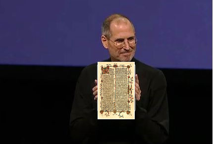
As you are undoubtedly well aware, Steve Jobs unveiled the newest Apple money-suck toy product on Wednesday: the iPad. The most immediate response was to its tone-deaf name. I don't actually find feminine hygiene products to be disgusting, but it's hard not to laugh at jokes about iTampons or iKotex. That last joke really works best with medievalists; for everyone else, you need to spend so long explaining what a codex is, that the frog has been dissected and dead long before they know what to laugh at. But even aside from menstrual jokes, the best joke I've seen comes from a medievalist. Tom Elrod's blog post, "Introducing the iCodex," captures the breathless adoration of Steve Jobs's fans and the rediscovery of reading technology.


This image from the blog captures what's smart and funny about it, as does this excerpt:
With the iCodex, people can now store multiple items in one, easy-to-use package. A user could, for example, enjoy both cooking recipes and psalms, or mappa mundi and instructions on marital relations. Since the iCodex's pages are bound together in an easy-to-turn format, things stored at the end of an iCodex are as easy to access as the beginning.
You need to go read the whole thing in full to appreciate it. Go, I'll wait here.

After that, when you're ready for some serious responses to the iPad, check out Alex Payne's response, which focuses on the iPad not as an e-book, but as a very small and slick personal computer. As an e-book it might work well, but in a way that disturbs Payne deeply: "The iPad is an attractive, thoughtfully designed, deeply cynical thing. It is a digital consumption machine." As he goes on to discuss, turning a notebook into a tool for consumption rather than creation has implications for the future of hacking and programming and, I would argue, for the ways in which familiarity with computer languages retreats even further into the hands of a small few. Payne's argument is worth considering, especially in light of what I discussed in my last post about the ability to create mash-ups, whether in book form or in music. Consumption is great, but it's creation that makes a technology stick and a culture grow. (On the flip side of Payne's argument, Daniel Tenner praises the iPad for exactly these features: Apple is "making a slick “uncomputer” that’s tailored to those people who don’t actually need a computer.")

A couple of last notes: I found most of these posts through Twitter, thanks to @MagBaroque, @academicdave, and @briancroxall. Finally, the jokes connecting computers and medieval books have been around for a while. I've posted this before, and many of you will have already seen it, but I still love it, so I leave you with the Medieval Help Desk: